
Key takeaways
- Responsive design is behavior across conditions, not a desktop layout squeezed smaller.
- Test Arabic RTL, forms, keyboards, slow networks, and real content.
- Performance and accessibility are part of mobile quality.
How this guide was prepared
This guide is written for organisations evaluating responsive website design Egypt in Egypt. It separates this intent from direct service-page terms and avoids unsupported prices, rankings, guarantees, or client claims.
The article combines Nova Roids delivery experience, the project portfolio linked on this page, and the named primary technical references. Any volatile commercial detail should be confirmed during discovery.
What this page owns—and what it deliberately excludes
This is the canonical page for the responsive website design Egypt query family. It answers the specific decision below without duplicating the service page or adjacent cluster articles.
Topics intentionally handled elsewhere
- Direct web development company intent
- Full accessibility compliance claims
- Website pricing
Direct service and enquiry intent belongs to our Web Development service page.
The broader topic is covered by Website Development Cost in Egypt: 2026 Pricing Guide.
Test layouts with real content and long labels
Navigation, cards, tables, buttons, and forms often break when content is longer than the design placeholder. Test Arabic and English separately, including long project names, prices, validation messages, and empty states.
Ready to move from planning to delivery? Review our web development process and deliverables.
Mobile interaction checklist
Check tap targets, sticky elements, menus, dialogs, carousels, input keyboards, file uploads, and orientation changes. Important actions should remain visible without covering content or competing with each other.
This article belongs to the Website Development Cost in Egypt: 2026 Pricing Guide topic cluster.
- No horizontal scrolling
- Readable text without zoom
- Visible keyboard focus
- Correct input types
- Accessible error messages
- Safe-area handling on modern phones
Performance on regional connections
Optimize image dimensions and formats, load critical content first, reduce JavaScript, and avoid autoplay media that blocks interaction. Test with network throttling and mid-range Android devices, not only a fast development computer.
The next related decision is covered in Small Business Website in Egypt: What You Actually Need.
Arabic RTL is more than text alignment
Direction affects navigation order, icons, breadcrumbs, form alignment, number handling, and component transitions. Use semantic direction at the document level and test mixed Arabic, English, phone numbers, and currency values.
Responsive design is a content and interaction system
A responsive website does more than resize columns. Navigation, reading order, forms, tables, filters, media, and calls to action must remain understandable at different widths and input methods. Design components around content rules so long Arabic labels, missing images, validation errors, and unusual data do not break the interface.
Start with the smallest practical layout and progressively enhance it. This reveals which information and actions are truly essential. Desktop design can then use extra space without creating a different product or hiding important behaviour from mobile users.
- Logical reading order
- Touch-friendly controls
- Flexible content components
- Keyboard and screen-reader support
- Consistent actions across breakpoints
A realistic device and browser QA plan
Test representative low, mid, and high-end devices rather than only using a desktop browser's responsive preview. Include portrait and landscape, zoom, large text, slow connections, form keyboards, and different browser engines. Focus on the user journeys that create revenue or operational risk.
Record issues by severity and affected journey. A small visual difference is not equal to a blocked form or inaccessible menu. Keep automated visual and functional checks for critical components where practical, then repeat manual testing before important releases.
- Real-device testing
- Browser-engine coverage
- Text zoom and orientation
- Form and keyboard behaviour
- Critical-journey regression tests
Performance budgets for responsive pages
Large media and JavaScript can make a visually responsive page unusable on mobile connections. Set budgets for image dimensions, script weight, fonts, and third-party tools. Load only the assets required for the current viewport and reserve space to prevent layout movement.
Measure real-user Core Web Vitals and segment results by device and page type. Laboratory tests are useful for diagnosis, but field data reveals how actual visitors experience the site. Prioritise improvements on high-traffic and high-conversion pages.
- Responsive image sizes
- Limited third-party scripts
- Font loading strategy
- Stable layout dimensions
- Field performance monitoring
A responsive QA workflow for every release
Define critical journeys, devices, browsers, languages, and accessibility checks before testing. Use realistic content and data. Test navigation, forms, tables, filters, media, modals, errors, and sticky actions at several widths, then repeat the highest-risk journeys on real devices.
Record issues with screenshots, environment, severity, and reproduction steps. Fix blocked tasks before visual differences. Add regression checks for components that have failed previously. This turns responsive design from a final inspection into a repeatable quality process.
- Critical journey list
- Real-device matrix
- RTL and long-content tests
- Regression record
Responsive design success measures
Monitor mobile conversion, form errors, Core Web Vitals, device-specific exits, support complaints, and accessibility findings. Compare the same journey across device groups instead of assuming all mobile traffic behaves alike.
Use recordings or usability sessions carefully and protect privacy. The purpose is to find interaction problems, not collect more data than necessary. Prioritise changes that improve task completion and stability for a meaningful audience.
- Mobile task completion
- Form and interaction errors
- Field performance
- Accessibility issues
Responsive quality checklist
| Area | What to verify | Why it matters |
|---|---|---|
| Layout | No clipping, overlap, unreadable columns, or horizontal scrolling | The interface remains usable across viewport sizes |
| Interaction | Touch targets, menus, forms, dialogs, and keyboard focus work | Users can complete tasks on touch and assistive inputs |
| Content | Headings, tables, media, and long words adapt safely | Information remains understandable, not merely visible |
| Performance | Images, fonts, scripts, and third parties are controlled | Mobile networks and devices receive a practical experience |
Questions and checks before you commit
What clients highlighted
“The website finally explains our services clearly, loads fast, and gives our team a cleaner way to receive qualified enquiries.”
“The SEO structure made the site easier to understand. We could see which pages target traffic, which pages convert, and what to publish next.”
Relevant Nova Roids project work
These case studies show related delivery experience. They do not imply that every feature discussed in this guide was used on every project.
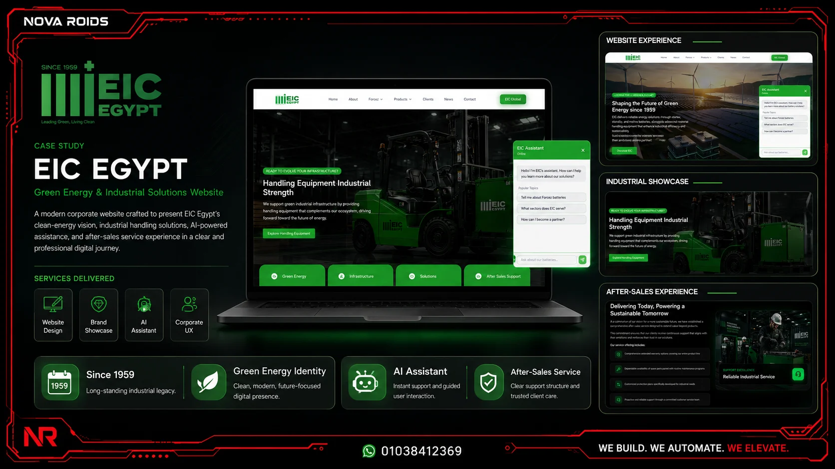
EIC Industrial Battery Platform
A bilingual industrial website presenting battery solutions, applications, company capabilities, technical content, and inquiry paths.
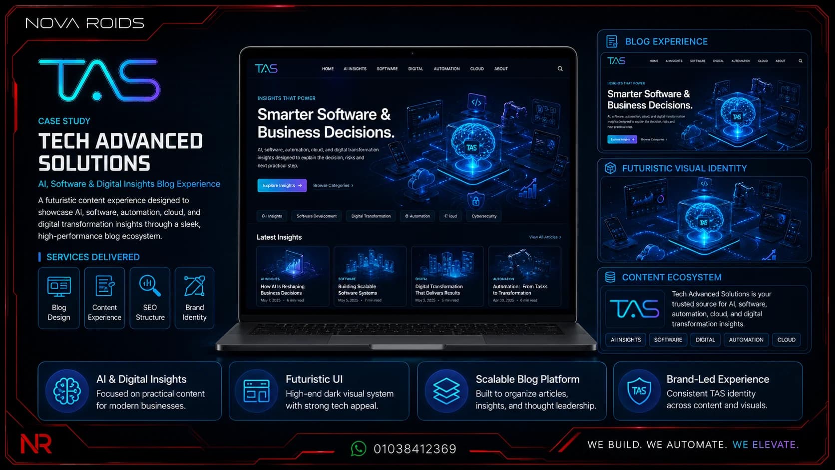
Tech Advanced Solutions
An international applied-AI, software, automation, cloud, and growth platform with product showcases and conversion-led service journeys.

Kayan Development
A developer website presenting Red Sea projects, lifestyle positioning, unit information, and direct inquiry journeys.
Frequently asked questions
What is responsive website design?+
Responsive design adapts layout, content, controls, and media to different screens and input methods while preserving usability, accessibility, and performance.
How many screen sizes should be tested?+
Use representative breakpoints during development, then test real devices and flexible widths. The goal is robust behavior between breakpoints, not a perfect screenshot at only three sizes.
Does responsive design affect SEO?+
Yes indirectly and directly through mobile usability, performance, content accessibility, and user experience. Google primarily evaluates the mobile version of content.
What should I prepare before discussing responsive website design Egypt?+
Prepare the business goal, target users, current system, required integrations, content or data sources, deadline, and success criteria. This makes the first discussion more useful and helps the delivery team identify assumptions and risks early.
How does this guide connect to the wider project?+
This page covers one focused search intent. Related pricing, platform, and service decisions are summarized briefly and linked to the page that owns each topic, which keeps the guidance clear and reduces duplicate coverage.
Author and technical review
Primary references
Need a scoped recommendation instead of a generic answer?
Share the current system, target users, required outcomes, and deadline. The Nova Roids team will identify the smallest practical next step and the assumptions that need validation.